 , but I'm having a hard time with this bulb. It's difficult to blend and make the colors soft and gradual. Bah. When painting glass, it's all about layers, layers, layers. If you don't have enough layers, the color will lack depth and be boring. It'll also be easier for the paint to flake off if your brush is too wet. That's super annoying and creates see-through holes in the work. So really, when you see a purple flower, it's got plum, violet, lavender, purple and white all mushed in it somewhere. It would be nice if I could find the exact same color every time, but every time I go back to it, I always get a different shade of purple than I ended with the previous day. But, again, flowers are versatile. If they differ in color, it's ok. There are different colors and varieties in nature, so it works. What I worked on most this time was creating depth. I made shadows and highlights. Didn't worry too much about blending just yet. That'll be at the end once I've defined individual flowers and petals.
Monday, February 7, 2011
Feb 6th: Acrylic on Glass Ornament
Back to the ornament! It might just be because I'm coming from canvas painting , but I'm having a hard time with this bulb. It's difficult to blend and make the colors soft and gradual. Bah. When painting glass, it's all about layers, layers, layers. If you don't have enough layers, the color will lack depth and be boring. It'll also be easier for the paint to flake off if your brush is too wet. That's super annoying and creates see-through holes in the work. So really, when you see a purple flower, it's got plum, violet, lavender, purple and white all mushed in it somewhere. It would be nice if I could find the exact same color every time, but every time I go back to it, I always get a different shade of purple than I ended with the previous day. But, again, flowers are versatile. If they differ in color, it's ok. There are different colors and varieties in nature, so it works. What I worked on most this time was creating depth. I made shadows and highlights. Didn't worry too much about blending just yet. That'll be at the end once I've defined individual flowers and petals.
, but I'm having a hard time with this bulb. It's difficult to blend and make the colors soft and gradual. Bah. When painting glass, it's all about layers, layers, layers. If you don't have enough layers, the color will lack depth and be boring. It'll also be easier for the paint to flake off if your brush is too wet. That's super annoying and creates see-through holes in the work. So really, when you see a purple flower, it's got plum, violet, lavender, purple and white all mushed in it somewhere. It would be nice if I could find the exact same color every time, but every time I go back to it, I always get a different shade of purple than I ended with the previous day. But, again, flowers are versatile. If they differ in color, it's ok. There are different colors and varieties in nature, so it works. What I worked on most this time was creating depth. I made shadows and highlights. Didn't worry too much about blending just yet. That'll be at the end once I've defined individual flowers and petals.

Feb 5th: Graphite 3/4 face
So, I couldn't get to the bulb on the 5th... my bad. Painting just wasn't happening *shr ug*. My Sensei is probably the most honest person when it comes to my artwork. She tells me that the thing I paint most and need the most work on is the 3/4 face. I admit, they're not my favorite thing to do. It's easy to make a symmetrical face... one that's looking straight forward... but 3/4 faces are funky. One eye's higher than the other. Half of the mouth is practically not there. You can kinda, sorta see one nostril while the other is in full view. It's just not easy!
 ug*. My Sensei is probably the most honest person when it comes to my artwork. She tells me that the thing I paint most and need the most work on is the 3/4 face. I admit, they're not my favorite thing to do. It's easy to make a symmetrical face... one that's looking straight forward... but 3/4 faces are funky. One eye's higher than the other. Half of the mouth is practically not there. You can kinda, sorta see one nostril while the other is in full view. It's just not easy!
So, gleaning what I've read these past couple of weeks, I tried to implement techniques. I started by making an oval in the basic shape of the figure's head. I then sketched lines for the eyes (halfway down the oval), no se (in between eyes and chin) and mouth (guessed at that one). It seemed to work well. Using my pencil to measure, I payed close attention to where the features were in relation to each other. I made sure the eyes didn't go past the corner of the mouth, etc. It was also important to pay attention to how high the right eye was in comparison to the left. Making them too high would make him look like a freak. It's not done yet, but what I do like is the mouth. Good mouth. But the eyes... Hmm. Well, I'll figure it out and let you know. Perhaps because there's no shading on the left side of the face yet... but something's funky. Anyways, my time shall be mostly devoted to the wedding bulb, but when I can't paint, I'll work on 3/4 faces.
 se (in between eyes and chin) and mouth (guessed at that one). It seemed to work well. Using my pencil to measure, I payed close attention to where the features were in relation to each other. I made sure the eyes didn't go past the corner of the mouth, etc. It was also important to pay attention to how high the right eye was in comparison to the left. Making them too high would make him look like a freak. It's not done yet, but what I do like is the mouth. Good mouth. But the eyes... Hmm. Well, I'll figure it out and let you know. Perhaps because there's no shading on the left side of the face yet... but something's funky. Anyways, my time shall be mostly devoted to the wedding bulb, but when I can't paint, I'll work on 3/4 faces.
 Friday, February 4, 2011
Feb 4th: Acrylic on Glass Ornament
Ok, time to get back to the ornaments. Last time I painted an ornament was  December and it's a little hard to go back to a smaller scale than canvas. You would think that painting on a smaller scale would be easier, but really it's more challenging. This ornament is for a wedding in March so I better get cracking.
When starting any ornament, I start by creating the basic shape of whatever it is (in this case, a bunch of flowers) in white paint. I need to create a good base with the white because otherwise the paint will flake and rub off. Such is the nature of acrylic on glass. On ce I got a good base, I began to add basic colors and shapes of petals. Flowers are versatile and look good whether artsy or realistic looking. I find I can play around with many colors and shapes and still end up with a good looking bunch of flowers. So that's what I did here. Just mixed different variations of purple, red and white and went nuts.
I ended with a basic idea of what I want and will begin to refine it and make the flowers more realistic tomorrow. The great part about painting on glass? It's ridiculously easy to scratch mistakes off.
 December and it's a little hard to go back to a smaller scale than canvas. You would think that painting on a smaller scale would be easier, but really it's more challenging. This ornament is for a wedding in March so I better get cracking.
 When starting any ornament, I start by creating the basic shape of whatever it is (in this case, a bunch of flowers) in white paint. I need to create a good base with the white because otherwise the paint will flake and rub off. Such is the nature of acrylic on glass. On
 ce I got a good base, I began to add basic colors and shapes of petals. Flowers are versatile and look good whether artsy or realistic looking. I find I can play around with many colors and shapes and still end up with a good looking bunch of flowers. So that's what I did here. Just mixed different variations of purple, red and white and went nuts.
 I ended with a basic idea of what I want and will begin to refine it and make the flowers more realistic tomorrow. The great part about painting on glass? It's ridiculously easy to scratch mistakes off.
Feb 3rd: Pen Cartooning
I had no time this Thursday. It was just a crazy busy day . So I didn't have a chance to try anything new or learn a new technique. Instead I found a book on cartooning and drew from it. I like cartoons because even if you don't get the faces perfect, it doesn't really matter. Cartoons are simple. I can draw them from a book, but my ability to create them from memory is harder. The cartoons that I draw myself are passable; nothing that would be in a comic book. The Sunday funnies sure. One of my all time favorite comic artists is Todd McFarlane. He does the "Spawn" series. The artwork is so intricate! It would take me weeks to draw what he probably does in hours. He's pretty amazing.
. So I didn't have a chance to try anything new or learn a new technique. Instead I found a book on cartooning and drew from it. I like cartoons because even if you don't get the faces perfect, it doesn't really matter. Cartoons are simple. I can draw them from a book, but my ability to create them from memory is harder. The cartoons that I draw myself are passable; nothing that would be in a comic book. The Sunday funnies sure. One of my all time favorite comic artists is Todd McFarlane. He does the "Spawn" series. The artwork is so intricate! It would take me weeks to draw what he probably does in hours. He's pretty amazing. Anyways, my random cartoon drawings are all of old men... a subject that I p robably never draw unless I'm paid to. These were done in purple archival ink. I couldn't tell you what kind of pen I was using because it's from Germany. Awesome anyway.
 robably never draw unless I'm paid to. These were done in purple archival ink. I couldn't tell you what kind of pen I was using because it's from Germany. Awesome anyway.
 Thursday, February 3, 2011
Feb 2nd: Watercolor and Pen
Watercolors are probably the hardest paint to deal with. You can't paint over your m istakes; you can only make them darker. The only experience I've had with watercolors was gained in elementary school with my Crayola set of 12 colors and a fraying paintbrush. Those were the days. Now I have this awesome stuff in tubes and I figure, I should try.
 istakes; you can only make them darker. The only experience I've had with watercolors was gained in elementary school with my Crayola set of 12 colors and a fraying paintbrush. Those were the days. Now I have this awesome stuff in tubes and I figure, I should try.
 I started with something easy to practice. My fall-back is anime. So, I started with a basic outline of Tohru Honda (Fruba FTW!) in graphite. I then set about to paint her in watercolor. It was pretty much as hard as I  expected it to be. Colors bleed together. Skin tone is pretty hard to acquire without looking too orange, too yellow, too brown... etc. So I settled on orange because that was close enough. In real life, the color isn't so horrifying until you see the shading on her neck. Wrong color plus the paper got so wet that it started to come apart. Yay...
 expected it to be. Colors bleed together. Skin tone is pretty hard to acquire without looking too orange, too yellow, too brown... etc. So I settled on orange because that was close enough. In real life, the color isn't so horrifying until you see the shading on her neck. Wrong color plus the paper got so wet that it started to come apart. Yay...
 Watercolors alone weren't going to work for a final product. It was too blah and in desperate need of some outlining. So I outlined Tohru in india ink and it looks much better. So, it's ok. Not the best watercolor, but passable. 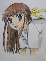

I'll have to practice more to get the hang of it.

Feb 1st: Charcoal Still Life
As I continued working on my still life, I began to wonder why I picked such  a hard object. There's scales and spikes and loops... Most people sketch fruit and dishes... Anyways, as I sketched along I realized that right away when using charcoal, light areas need to be marked somehow. That way you don't smudge over the light spots or make them too dark to be able to pull out with an eraser.
 a hard object. There's scales and spikes and loops... Most people sketch fruit and dishes... Anyways, as I sketched along I realized that right away when using charcoal, light areas need to be marked somehow. That way you don't smudge over the light spots or make them too dark to be able to pull out with an eraser.
 The dragon is supposed to look shiny. Or at the very least, plastic. It's tech nically resin, but shiny nonetheless. I don't know how shiny I got it to look. Nor did I want to take the time to sketch hundreds of individual scales. But, regardless, I sketched until it was kinda done. The loops are all wrong! They don't look like they're a smooth coil. Kinda kinked and awkward really. That has a lot to do with me not measuring the negative space with my eyes well enough. Bah. I don't think I'll finish it, but it was a good try. Next time I do a still life, I'm going to pick something a little simpler to draw until I get used to looking at a 3D object.
 nically resin, but shiny nonetheless. I don't know how shiny I got it to look. Nor did I want to take the time to sketch hundreds of individual scales. But, regardless, I sketched until it was kinda done. The loops are all wrong! They don't look like they're a smooth coil. Kinda kinked and awkward really. That has a lot to do with me not measuring the negative space with my eyes well enough. Bah. I don't think I'll finish it, but it was a good try. Next time I do a still life, I'm going to pick something a little simpler to draw until I get used to looking at a 3D object.
 Tuesday, February 1, 2011
Jan 31st: Charcoal Still Life
Yesterday night I snatched my dragon off of the fireplace ma ntle to draw it. I'm not good at still life's. Maybe it's because with a picture, the light never changes, the subject never moves and you can take it wherever you want. I also decided to work in charcoal which is another medium that I'm reluctant about. You can't really erase charcoal. One thing you can do is make it darker over your mistakes. So that's what I did. I started with an outline as light as I could draw it in vine charcoal and tried to focus on shape rather than detail. A big problem of mine is focusing too much on detail too early in the drawing and not on shape. That's when proportion gets messed
  up.
up.
I decided to draw on bigger paper than I'm used to. I want to get used to drawing with larger arm movements rather than small, short hand movements. Once I'm used to it, drawing will be easier and I won't try to be so precise right off the bat. Smudging charcoal/graphite with your finger always makes me shudder, but yesterday I went for it. I know that over time the oils in your fingers could yellow the art. But since I'm just practicing, I smudged away. It worked pretty good. I think that for my charco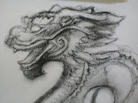 al work, that'll how I'll do blending unless I'm doing something that needs to last a long time. I'm doing better than expected. I wish there weren't so many scales...
 ntle to draw it. I'm not good at still life's. Maybe it's because with a picture, the light never changes, the subject never moves and you can take it wherever you want. I also decided to work in charcoal which is another medium that I'm reluctant about. You can't really erase charcoal. One thing you can do is make it darker over your mistakes. So that's what I did. I started with an outline as light as I could draw it in vine charcoal and tried to focus on shape rather than detail. A big problem of mine is focusing too much on detail too early in the drawing and not on shape. That's when proportion gets messed
  up.
up. I decided to draw on bigger paper than I'm used to. I want to get used to drawing with larger arm movements rather than small, short hand movements. Once I'm used to it, drawing will be easier and I won't try to be so precise right off the bat. Smudging charcoal/graphite with your finger always makes me shudder, but yesterday I went for it. I know that over time the oils in your fingers could yellow the art. But since I'm just practicing, I smudged away. It worked pretty good. I think that for my charco
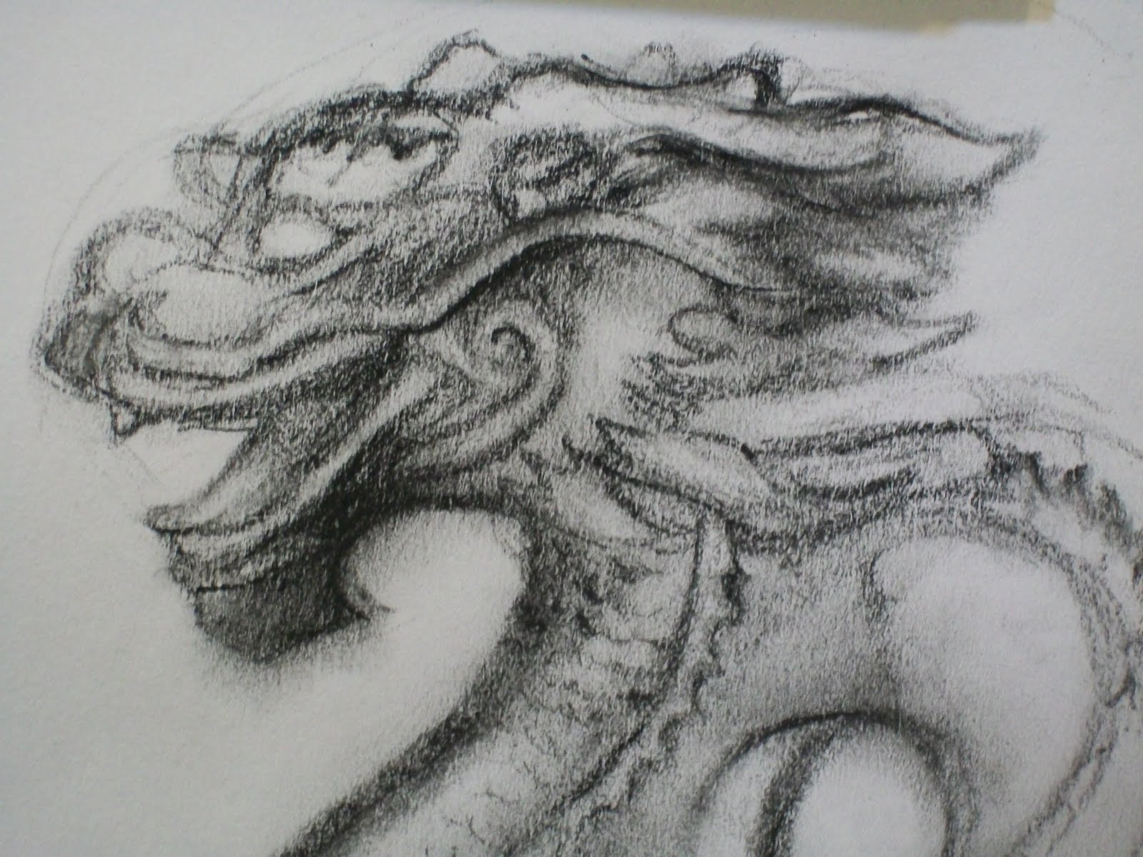 al work, that'll how I'll do blending unless I'm doing something that needs to last a long time. I'm doing better than expected. I wish there weren't so many scales...
Subscribe to:
Posts (Atom)